Within Reports
Which Charts Actually Change the Decision?
The fastest route to a report's evidence often runs through the few tables and charts that carry costs, risks, or forecasts.
On this page
- Finding decision critical tables first
- Reading captions before narrative sections
- Checking whether visuals support the conclusion
Page outline Jump by section
Introduction
When the goal is to increase reading speed, one of the most effective report-skimming techniques is to identify the small number of tables and charts that could actually change a decision. In many reports, dozens of pages of explanation surround only a handful of visuals that contain the critical evidence: projected costs, expected benefits, risk rankings, performance trends, forecast scenarios, or outcome comparisons. Those visuals often compress entire sections into a single page and reveal the report’s real argument faster than narrative text. Reports designed for decision-makers frequently prioritise concise evidence presentation because readers need to understand implications quickly rather than absorb every detail. [express.excelsior.edu]express.excelsior.eduChapter 8.2: ExecutiveSummary and Report ConstructionThis chapter examines the systematic construction of executive summaries and professional reports that tra…
 The skill is not simply finding charts. It is finding the charts that carry consequences. A decorative chart may illustrate a point, while a decision-critical chart can determine whether a proposal is approved, delayed, funded, rejected, or reconsidered.
Which Charts Actually Change the Decision?
Not every visual deserves equal attention. The fastest readers learn to separate explanatory graphics from decision-driving evidence.
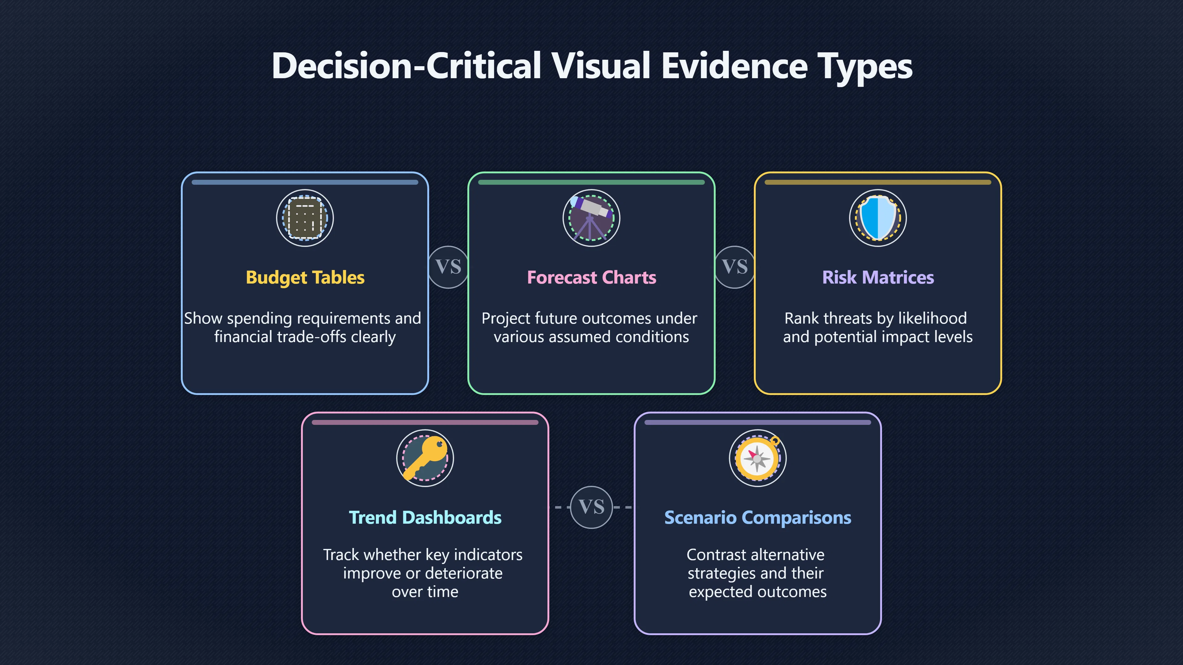
Decision-critical visuals usually fall into a few recurring categories:
- Cost and budget tables showing spending requirements, savings, or financial trade-offs.
- Forecast charts projecting future outcomes under different assumptions.
- Risk matrices ranking threats by likelihood and impact.
- Performance trend charts showing whether key indicators are improving or deteriorating.
- Scenario comparisons contrasting alternative strategies or outcomes.
- Summary-of-findings tables that condense large amounts of evidence into a single view. Structured evidence summaries are widely used because they allow readers to judge effect size, certainty, and practical significance quickly. [Cochrane]cochrane.orgChapter 14: CompletingChapter 14: Completing 'Summary of findings' tables and…'Summary of findings' tables present the main findings of a review in…
A useful test is simple: if a chart disappeared from the report, would the recommendation become harder to justify? If the answer is yes, that chart deserves immediate attention.
For example, in a proposal to expand a service, twenty pages of narrative may explain market conditions and implementation details. Yet the final decision may depend primarily on three visuals:
- A cost projection table.
- A demand forecast chart.
- A risk assessment matrix.
Reading those first often provides most of the information needed to evaluate the recommendation.
Finding Decision-Critical Tables First
Rather than reading every section sequentially, scan the report for visual evidence before committing to detailed reading.
A rapid process is:
- Flip through the report and note every table, figure, and chart.
- Read only their titles and captions.
- Mark visuals containing forecasts, costs, risks, comparisons, or outcome measures.
- Ignore descriptive visuals that merely provide background.
- Return to the surrounding text only for the visuals that matter.
This approach works because tables and figures are commonly designed to summarise and reinforce the report’s main points rather than repeat every detail. Government and academic reporting guidance explicitly treats tables as concentrated demonstrations of key findings and evidence. [Government Analysis Function]analysisfunction.civilservice.gov.ukernment Analysis Function Data visualisation: tablesernment Analysis FunctionData visualisation: tables - Government Analysis Function19 May 2022 — This guidance provides advice on how t…
In practice, readers often discover that a fifty-page report contains fewer than ten visuals worth close inspection and perhaps only three or four that materially affect the decision.
Read the Caption Before the Narrative
One of the fastest evidence-extraction techniques is reading captions before reading paragraphs.
A chart’s title, subtitle, caption, and footnotes often reveal:
- What question the chart answers.
- Which variables matter.
- What comparison is being made.
- Which trend the author wants readers to notice.
- Whether important limitations apply.
Data-visualisation research consistently shows that titles and captions shape how readers interpret charts and remember findings. Readers frequently combine visual prominence with caption cues when deciding what the chart means. When chart emphasis and caption emphasis align, the intended takeaway becomes more memorable. [European Data Portal+2arXiv]data.europa.euEuropean Data PortalThe importance of visualisation titlesData visualisation practitioners, like visual journalists, agree that guiding t…
This has a practical implication for fast reading. Instead of asking, “What does this chart show?”, first ask, “What is the author trying to make me notice?”
A caption such as:
Revenue growth slowed despite increased marketing expenditure.
immediately tells the reader where attention should be directed. The surrounding pages may provide context, but the key claim is already visible.
Research on chart captions also suggests that explanatory text improves comprehension and recall by helping readers recognise important patterns rather than merely observe shapes and numbers. [arXiv]arxiv.orgarXiv Vis Text: A Benchmark for Semantically Rich Chart CaptioningVisText: A Benchmark for Semantically Rich Chart CaptioningAbstract. Captions that describe or explain charts help improve recall an…
The Three Questions to Ask Every Key Visual
Once a potentially important table or chart has been identified, three questions quickly determine its value.

What decision does this visual support?
Every important visual exists to justify or challenge a recommendation.
A forecast chart may support expansion. A risk chart may support caution. A performance dashboard may support maintaining the current strategy.
If the connection between the visual and the recommendation is unclear, the visual may be less important than it appears.
What assumption is hidden inside it?
Many influential charts depend on assumptions that are easy to overlook.
Examples include:
- Forecast growth rates.
- Inflation estimates.
- Market demand projections.
- Expected adoption rates.
- Risk probabilities.
The visual may look authoritative while resting on assumptions that deserve scrutiny. A single assumption can sometimes matter more than the chart’s precise numbers.
What would change the conclusion?
Look for thresholds.
For example:
- Would a lower growth rate eliminate projected benefits?
- Would a higher cost estimate remove expected savings?
- Would a different risk assessment reverse the recommendation?
Decision-relevant visuals often become much clearer when viewed as tests of sensitivity rather than fixed predictions.
Checking Whether the Visual Supports the Conclusion
Fast readers should never assume that a chart automatically proves the point being made.
Several warning signs deserve attention:
- The conclusion is stronger than the evidence shown.
- A chart displays correlation while the text implies causation.
- Important uncertainty ranges are omitted.
- Only favourable scenarios are presented.
- The chart’s scale exaggerates small differences.
- The visual highlights a trend that appears weaker when examined closely.
Research into chart interpretation shows that readers are heavily influenced by visual emphasis and accompanying text, which makes critical checking especially important. [arXiv]arxiv.orgOpen source on arxiv.org.
A useful habit is to read the recommendation first, then inspect the supporting visual and ask:
“Would I reach the same conclusion from the chart alone?”
If the answer is no, the report may require closer reading before any decision is made.

When Tables Beat Charts
Fast readers often focus on charts because they appear easier to digest. However, some of the most important evidence appears in tables.
Tables are especially valuable when decisions depend on:
- Exact values.
- Detailed comparisons.
- Multiple variables at once.
- Confidence levels or evidence quality.
- Financial breakdowns.
In evidence reviews and technical reports, summary tables are frequently used because they allow readers to compare outcomes, effect sizes, certainty, and limitations more efficiently than narrative text. [Cochrane]cochrane.orgChapter 14: CompletingChapter 14: Completing 'Summary of findings' tables and…'Summary of findings' tables present the main findings of a review in…
A chart may reveal that one option performs better. A table often reveals whether the difference is large enough to matter.
The Speed-Reading Payoff
The fastest route through a report rarely follows page order. It follows the evidence trail. By locating the few tables and charts that contain costs, risks, forecasts, or outcome comparisons, a reader can often understand the practical implications of a report long before reading its detailed explanations.
For decision-focused reading, the goal is not to inspect every visual. It is to identify the handful that carry the recommendation, read their captions carefully, test whether they genuinely support the conclusion, and only then decide which sections deserve deeper attention. That approach turns charts and tables from illustrations into navigation tools, allowing readers to reach the most consequential evidence in a fraction of the time.
Amazon book picks
Further Reading
Books and field guides related to Which Charts Actually Change the Decision?. Use these as the next step if you want deeper reading beyond the article.
The Visual Display of Quantitative Information
Explains how charts convey evidence and support decisions.
Storytelling with Data
First published 2015. Subjects: Computer graphics, Business communication, Information visualization, Applied, General.

How Charts Lie
First published 2019. Subjects: Computer graphics, Charts, Information visualization, Social media, Technology.
eBay marketplace picks
Marketplace Samples
Example marketplace items related to this page. Use the search link to explore similar finds on eBay.


Endnotes
-
Source: express.excelsior.edu
Title: Chapter 8.2: Executive
Link: https://express.excelsior.edu/datascience/chapter/chapter-8-2-executive-summary-and-report-construction/Source snippet
Summary and Report ConstructionThis chapter examines the systematic construction of executive summaries and professional reports that tra...
-
Source: cochrane.org
Title: Chapter 14: Completing ‘
Link: https://www.cochrane.org/authors/handbooks-and-manuals/handbook/current/chapter-14Source snippet
Chapter 14: Completing 'Summary of findings' tables and...'Summary of findings' tables present the main findings of a review in...
-
Source: arxiv.org
Link: https://arxiv.org/abs/2101.08235 -
Source: arxiv.org
Title: arXiv Emphasis Checker: A Tool for Guiding Chart and Caption Emphasis
Link: https://arxiv.org/abs/2307.13858 -
Source: arxiv.org
Title: arXiv Vis Text: A Benchmark for Semantically Rich Chart Captioning
Link: https://arxiv.org/html/2307.05356Source snippet
VisText: A Benchmark for Semantically Rich Chart CaptioningAbstract. Captions that describe or explain charts help improve recall an...
-
Source: arxiv.org
Title: arXiv How Do Captions Affect Visualization Reading?
Link: https://arxiv.org/abs/2205.01263 -
Source: nationaltraining.edu.au
Title: making financial reports understandable
Link: https://nationaltraining.edu.au/making-financial-reports-understandable/Source snippet
Make Financial Reports Understandable12 May 2025 — Simplify financial reports with visuals, plain English & storytelling. Learn how to ma...
Published: May 2025
-
Source: analysisfunction.civilservice.gov.uk
Title: ernment Analysis Function Data visualisation: tables
Link: https://analysisfunction.civilservice.gov.uk/policy-store/data-visualisation-tables/Source snippet
ernment Analysis FunctionData visualisation: tables - Government Analysis Function19 May 2022 — This guidance provides advice on how t...
Published: May 2022
-
Source: data.europa.eu
Link: https://data.europa.eu/apps/data-visualisation-guide/the-importance-of-visualisation-titlesSource snippet
European Data PortalThe importance of visualisation titlesData visualisation practitioners, like visual journalists, agree that guiding t...
-
Source: assets.publishing.service.gov.uk
Link: https://assets.publishing.service.gov.uk/media/67489b9d5ba46550018cebd8/Research_reports_guidance.pdfSource snippet
reports guidanceand follow the Government Analysis Function guidance on data visualisation for charts. To help clarity: • follow the usua...
Additional References
-
Source: clauswilke.com
Link: https://clauswilke.com/dataviz/figure-titles-captions.htmlSource snippet
22 Titles, captions, and tablesIn this chapter, I will discuss how to properly title and label figures. I will also discuss how to presen...
-
Source: ctrlprint.com
Title: 5 inspiring annual report examples to elevate your business reports
Link: https://ctrlprint.com/news/5-inspiring-annual-report-examples-to-elevate-your-business-reportsSource snippet
5 inspiring annual report examples to elevate your...22 May 2026 — Explore 5 outstanding annual report examples, learn key components, a...
Published: May 2026
-
Source: fusioncharts.com
Title: how to effectively use text in a data visualization
Link: https://www.fusioncharts.com/blog/how-to-effectively-use-text-in-a-data-visualization/Source snippet
202611 Jun 2014 — In this article, we'll talk about the five text elements and how they enhance the meaning of any data visualization...
-
Source: lucid.now
Title: visual storytelling in financial reports
Link: https://www.lucid.now/blog/visual-storytelling-in-financial-reports/Source snippet
25 Oct 2025 — Financial reports can be overwhelming. Visual storytelling transforms raw data into clear, engaging visuals like graphs and...
-
Source: bridgeall.com
Title: 4 key power bi reports for your finance team
Link: https://www.bridgeall.com/2023/05/26/4-key-power-bi-reports-for-your-finance-team/Source snippet
26 May 2023 — In this article we discuss how Power BI can be used to help your finance team and 4 key power bi reports for finance...
Published: May 2023
-
Source: writingcenter.unc.edu
Title: The Writing Center Figures and Charts
Link: https://writingcenter.unc.edu/tips-and-tools/figures-and-charts/Source snippet
The Writing CenterFigures and Charts - The Writing CenterThis handout will describe how to use figures and tables to present complicated...
-
Source: anychart.com
Title: Summarize Your Data in Plain English
Link: https://www.anychart.com/blog/2017/04/05/chart-captions-title-graph-tips/Source snippet
How to Name a Graph: Tips for Writing Great Chart Captions5 Apr 2017 — Here are some tips to help you come up with excellent chart captio...
-
Source: filwd.substack.com
Title: data visualization titles a taxonomy
Link: https://filwd.substack.com/p/data-visualization-titles-a-taxonomySource snippet
Visualization Titles: A Taxonomy - by Enrico BertiniThe second option is to use titles that guide the reader in the interpretation of the...
-
Source: abacum.ai
Title: financial reports for board meetings
Link: https://www.abacum.ai/blog/financial-reports-for-board-meetingsSource snippet
4 Financial Reports for Board Meetings18 Jun 2025 — This article explores the essential financial reports every board meeting should incl...
-
Source: julius.ai
Title: data visualization finance industry
Link: https://julius.ai/articles/data-visualization-finance-industrySource snippet
9 Principles of Data Visualization in the Finance Industry...5 Nov 2025 — Data visualization in the finance industry helps teams transfo...
Topic Tree